App Redesign
Mobile App Redesign | PatientConnect Mobile (PCM)
A RPM Telehealth solution that helps patients better manage their conditions.
PatientConnect Mobile UI Redesign - 2022


“What started as a goal to reduce tech debt became a redesign of our patient facing legacy and mobile apps.”
The challenge
Due to the extreme tech debt our team was facing, our legacy app became nearly impossible to update or implement change. This lead us to a redesign. needed to be HRS provisioned PatientConnect experience is not consistent with its BYOD (bring your own device) counterpart and runs on a codebase that causes extreme technical debt.
How can we deliver a singular experience that is intuitive, consistent, and addresses the major pain points of our current experiences?
The Goal
Unify the provisioned and BYOD experiences and update the visual design to be modern, delightful, and consistent with HRS branding.
UX|UI Objectives
Identify, research, test, and enhance key features
Restructure the IA and navigation
Create a mobile UI kit
Establish look and feel and Improve visual/UI design
My Role | UX|UI Design Lead
Lead UX|UI Designer for the creation of PCM’s mobile components and Mobile UI Kit
Collaborated closely with product and development leads to conduct initial discovery and user research, create user stories, and help maintain the project backlog
Led design reviews and product demos with customers and key internal steak-holders
Collaborated with our client facing teams to identify user goals, needs, and pain-points
Assisted UX research team with usability studies, client interviews, and database management
Created wireframes, site maps, and advanced clickable prototypes
Helped create collateral and educational resources for marketing, product, and client success teams
Advocated for UX|UI and accessibility best practices
Legacy and BYOD Applications

PatientConnect - Pre-Redesign: Provisioned Tablet Experience (Left) and BYOD Experience (Right)
Pros: Core functionality, to submit metrics to the clinician, is straight forward and easy to user after initial training.
Cons: Navigationally and visually the Provisioned and BYOD experiences are inconsistent. Provisioned application IA and navigation is confusing, and UI has low contrast, stretched fonts, and poor hierarchy. BYOD experience requires many clicks to access key feature which are hidden within the menu and has no company branding.
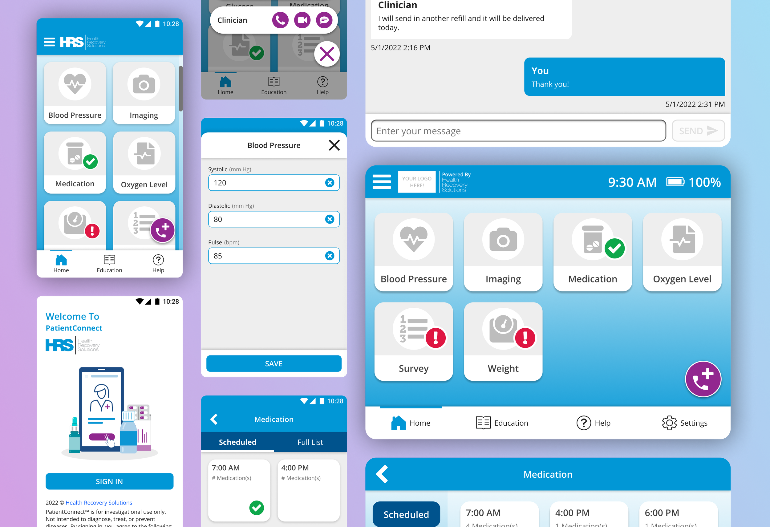
Post Redesign

PaitentConnect - Post Redesign: Provisioned Tablet Experience (Left) and BYOD Experience (Right)
What was changed
Created a consistent experience between Provisioned and BYOD
Updated AI and navigation to be more intuitive and useful
Enhanced branding for HRS and our clients
Brought essential features like education, support, calling to the foreground
Updated the visuals to be lighter, have more contrast, and on brand
Larger text to increase readability for our age demographic of 80+
FEATURES REDESIGNS:
The following flows were enhanced or added as new features. To lean more about the individual workflows select the links below.
Medication
Communication
Historical Data Tracking [Currently In Progress!]
MOBILE UI KIT:
Created a repository of all functional and perceptual pattens needed to create HRS’s PatientConnect application
Conducted internal interviews and usability tests to ensure the kit had everything our engineers needed
Collaborated with frontend and UI developers to ensure our kit matched their design kit 1:1
Established typograph, overall look and feel, iconography, and colors

Mobile UI Design Kit - Welcome Page
Site Map
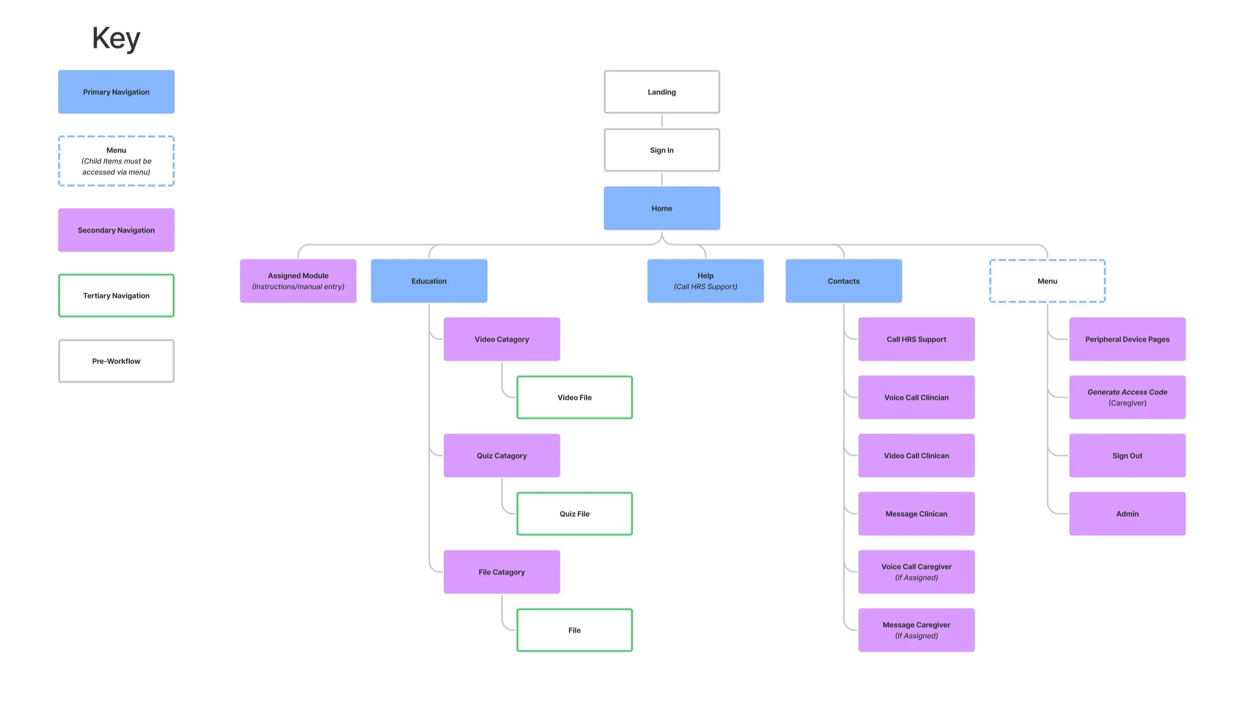
PatientConnect Site Map: Post Redesign